BRAND DIRECTION.

CREATING A NEW BRAND
THE CHALLENGE
Starting from a blank page, I developed the Cofaqtor brand from the ground up, including naming, positioning, identity, and the foundation for a scalable product system.
THE WORK
Brand Strategy
Naming
Brand Identity
Product Architecture
Packaging Design
Creative Direction
Generative AI Design

THE SOLUTION
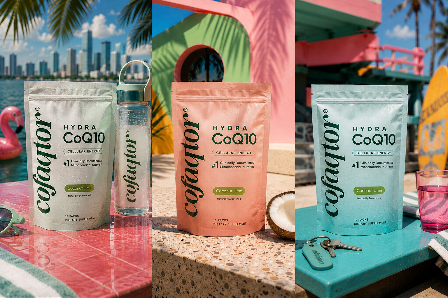
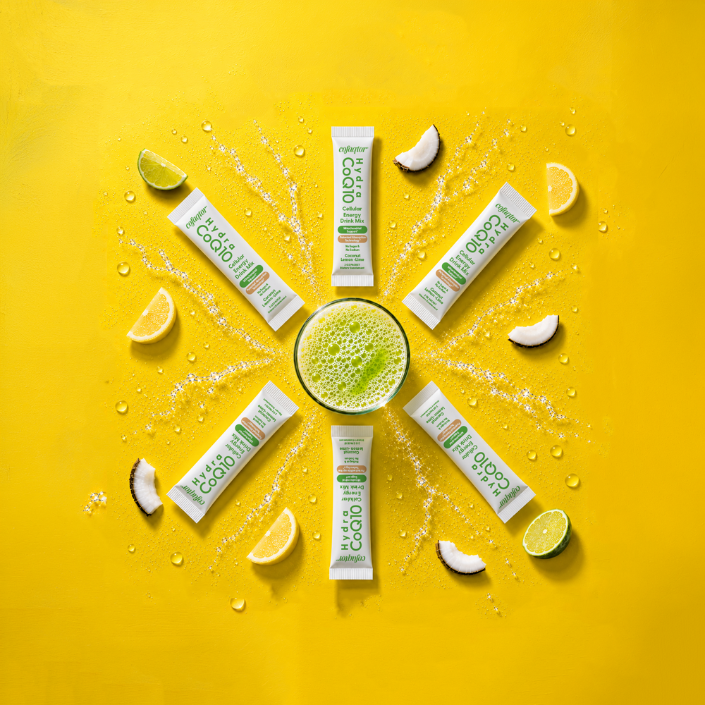
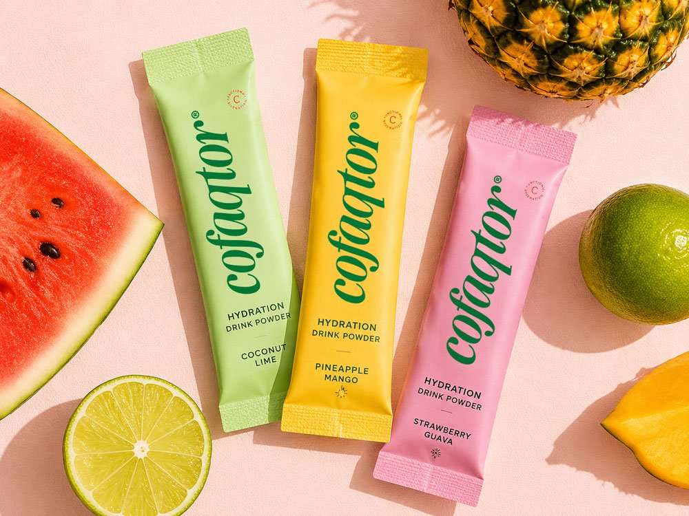
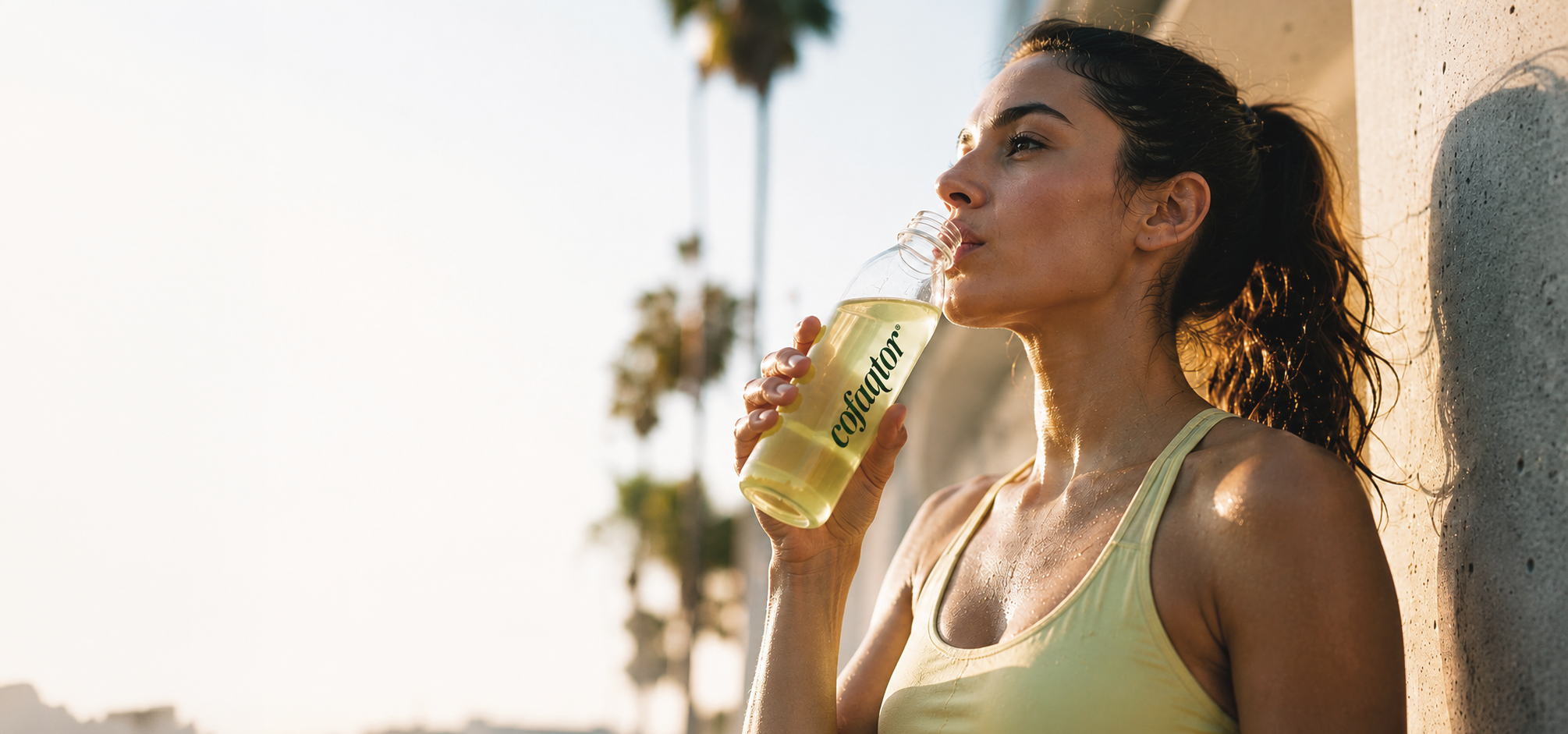
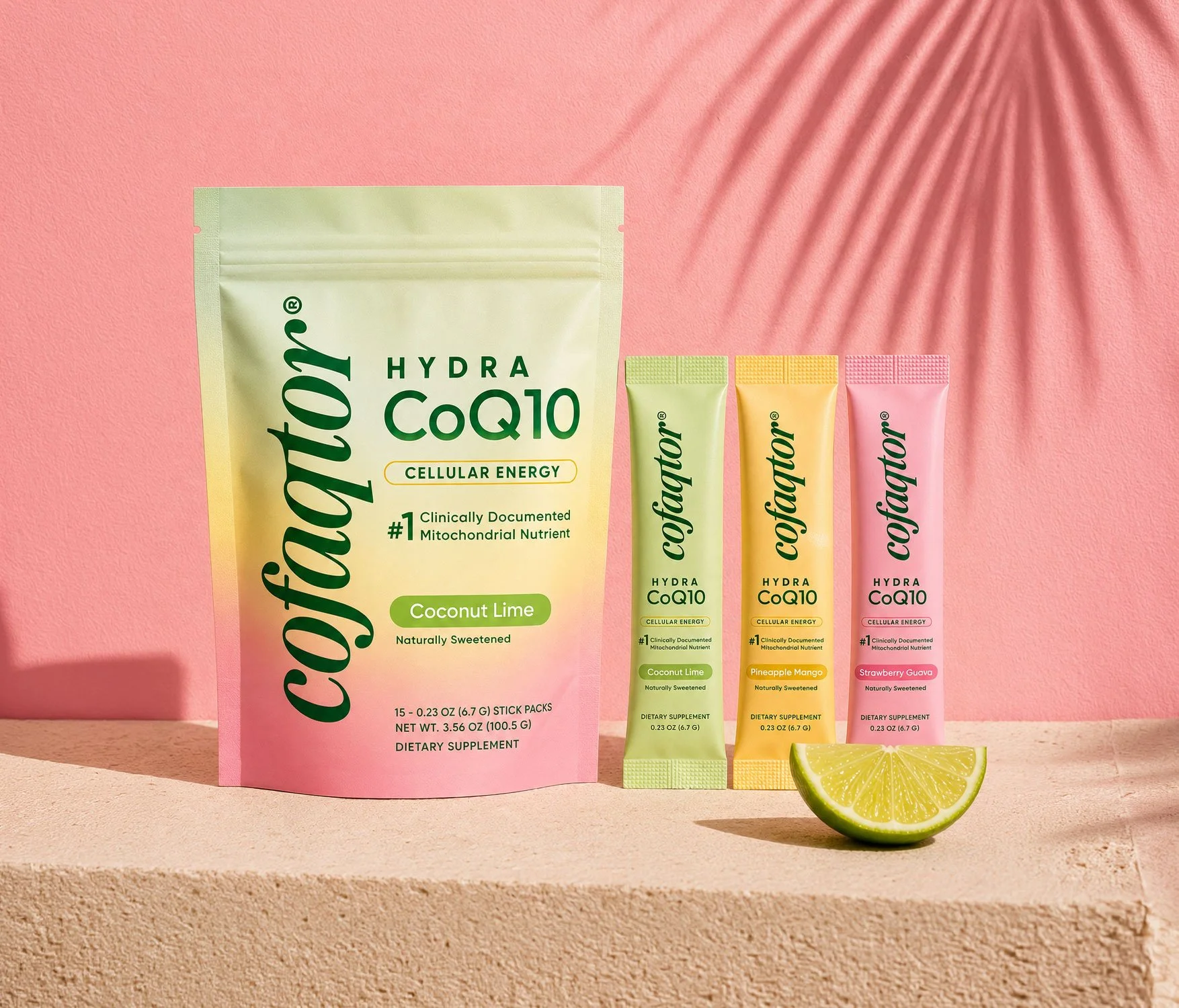
The strategy was to make cellular energy feel both scientifically credible and naturally accessible. Cofaqtor’s refined identity balances clinical authority with a more elevated wellness aesthetic, while the packaging system turns that positioning into a clear, scalable product family designed to stand apart in a crowded supplement category.
THE CHALLENGE
Brand PROFILE
For Nextday Wellness, the work was about turning an early-stage wellness concept into a more defined brand direction.
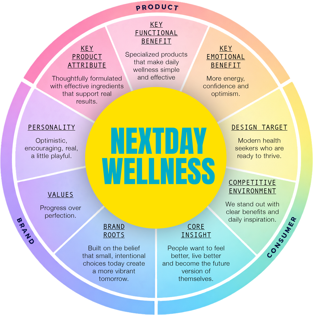
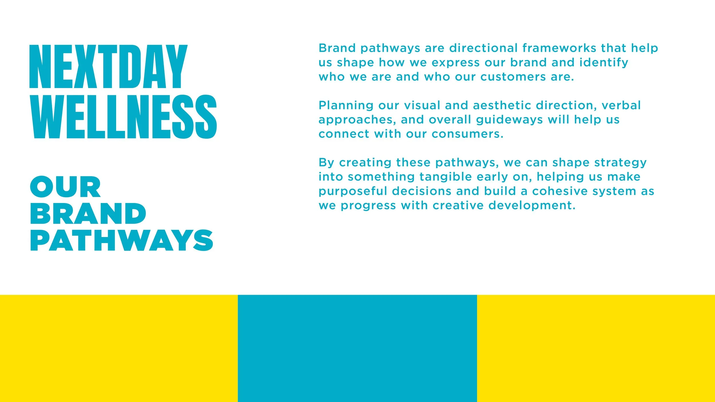
I created brand pathways to clarify how the brand should look, sound, behave and connect with consumers, using those pathways to make the strategy tangible before moving into full creative development.
I started with a classic brand wheel, and went from there.
THE WORK
Brand Strategy
Brand Personality
Brand Pathways
Consumer Archetype
Creative Direction
The plan was to give the project a simple brand roadmap: first, define the strategic framework, then build a memorable and ownable personality, and last, translate that thinking into a visual system designed to stand out.
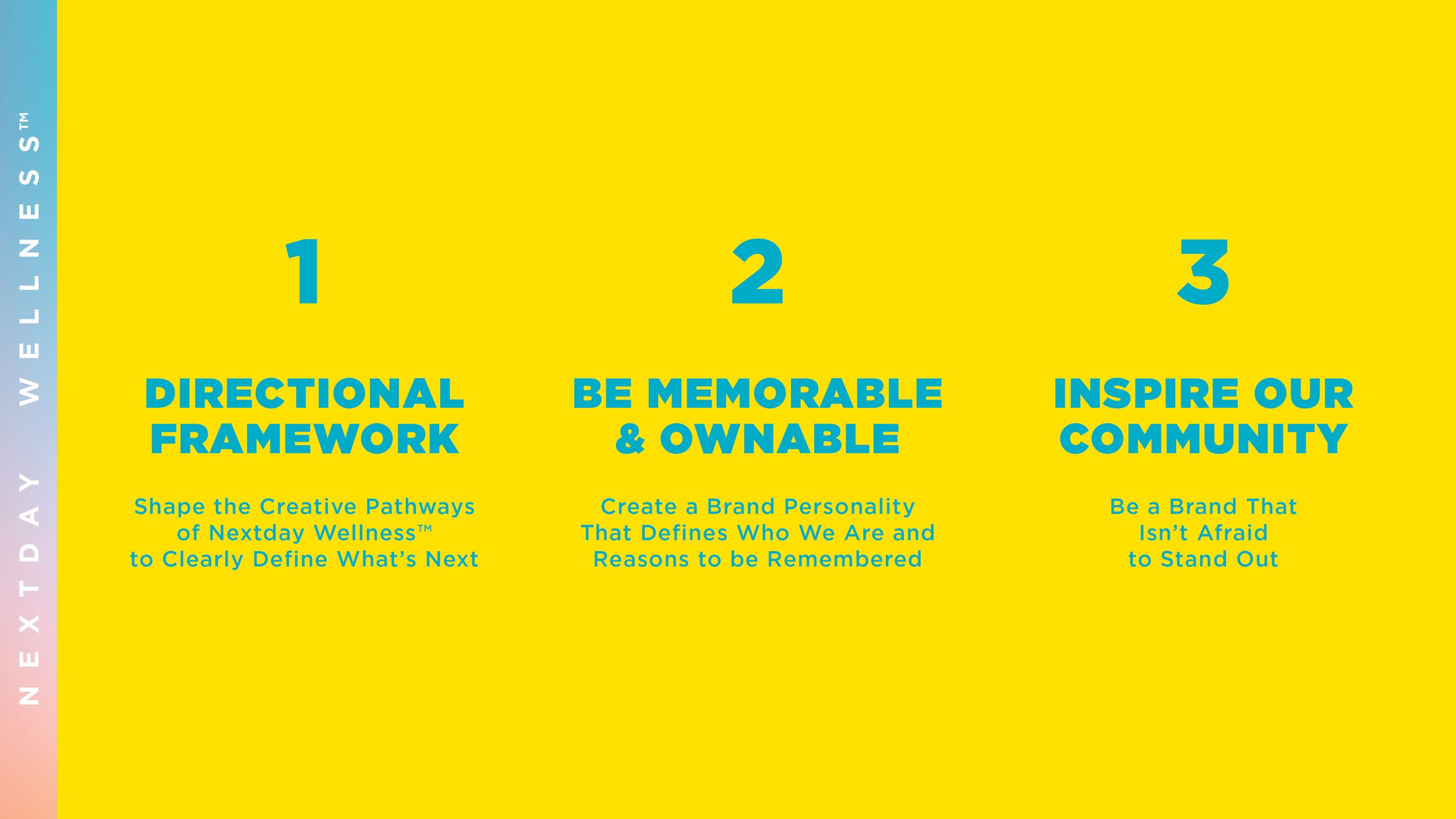
My first step for the client was to introduce strategic brand pathways.
Consumer archetype and creative direction are key for shaping a brand, helping to translate future ideas into a clear personality, positioning framework and visual territory that guide identity and packaging development.
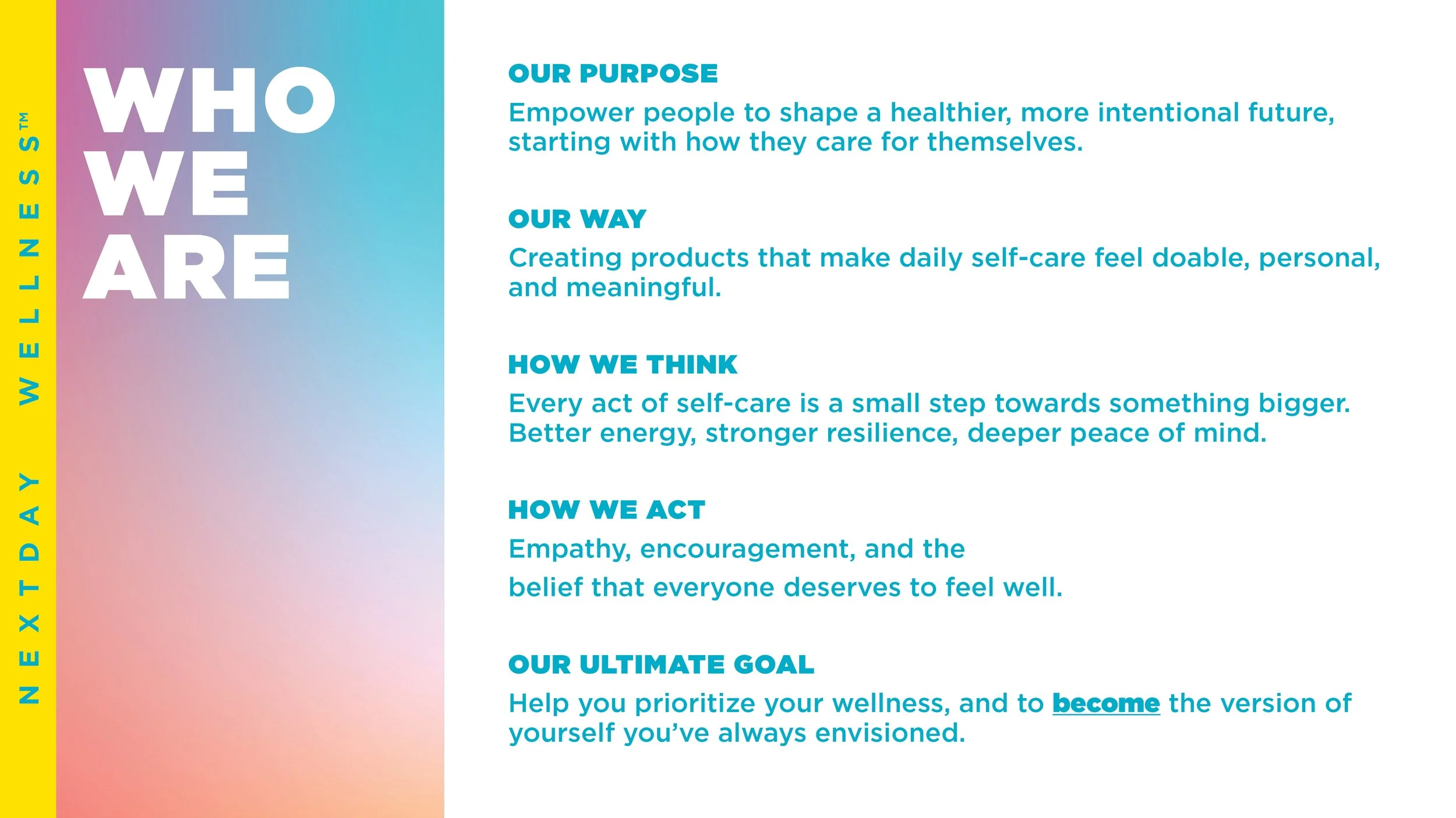
I built out the operating personality for who we are: its purpose, point of view, behavior and ambition.
This gave Nextday a consistent filter for how the brand should communicate, create products and ultimately show up for consumers.
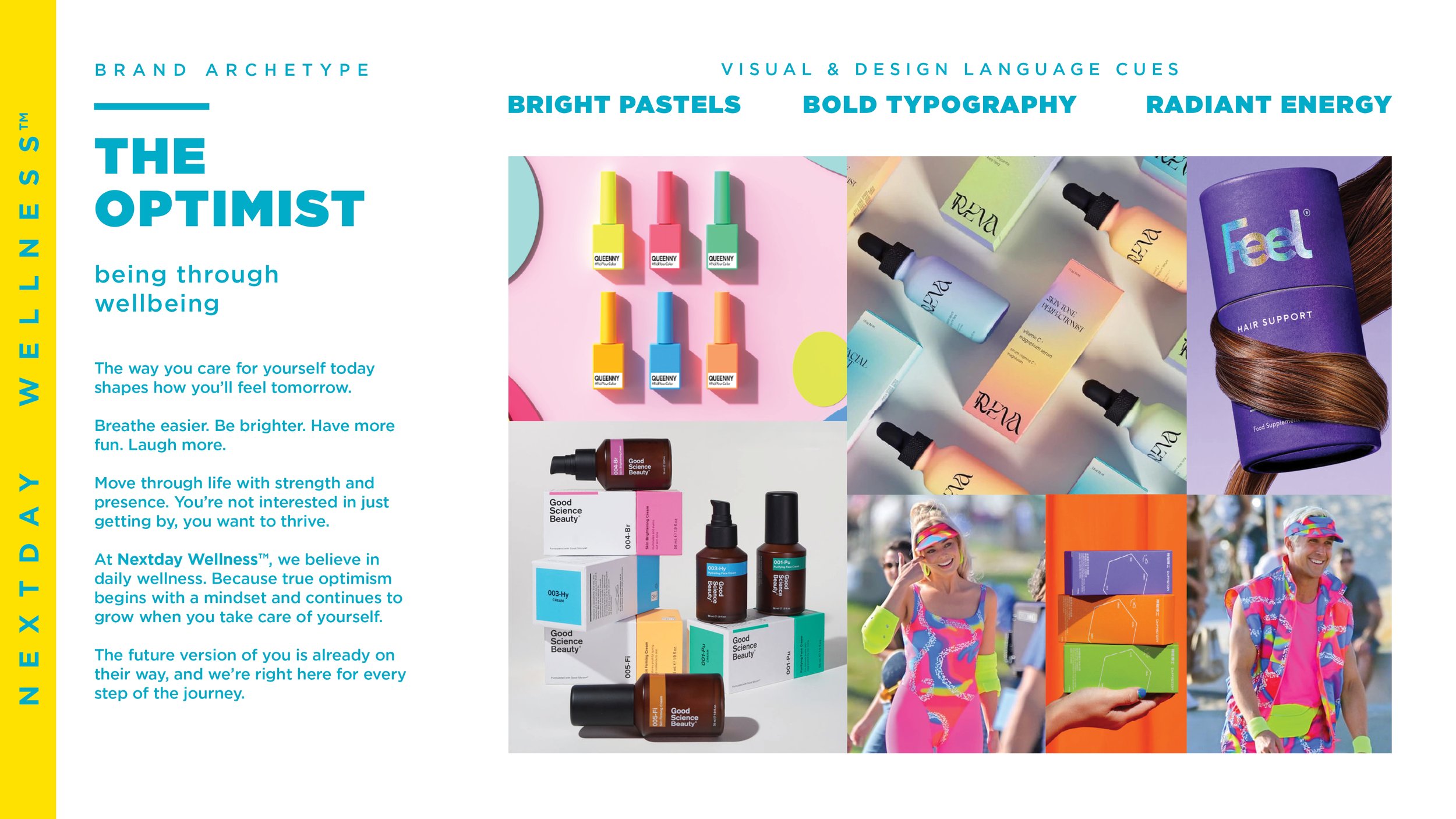
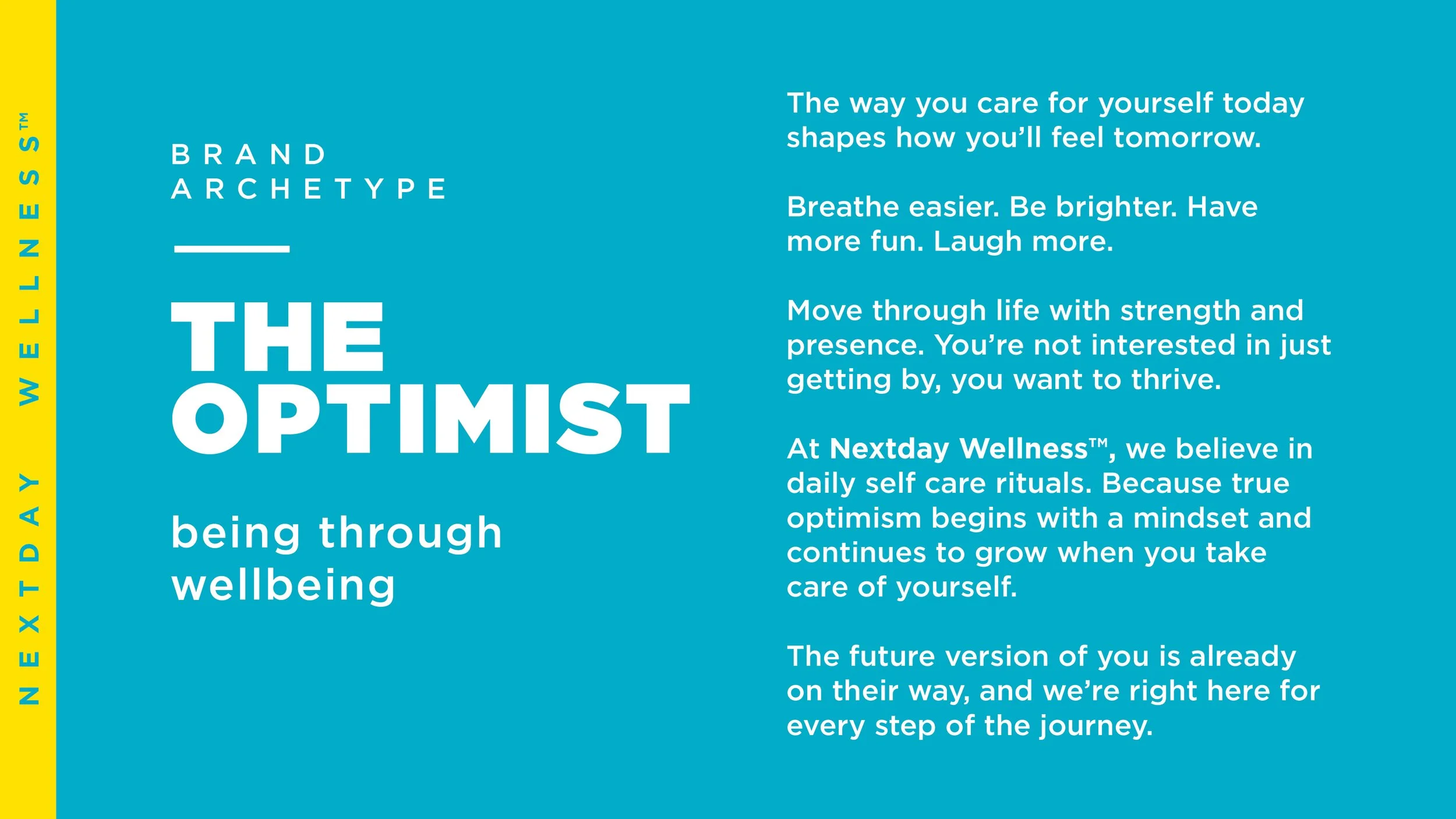
From there, I developed The Optimist archetype as a core brand personality, built around the idea that the way you care for yourself today shapes how you feel tomorrow.
That became the foundation for the brand’s purpose, tone and consumer-facing mindset. Aspiring to make your next day your best day.
The strategy then became a visual filter. I defined a direction built around bright pastels, bold typography and radiant energy, giving the brand a distinctive creative territory to guide future identity and packaging development.